Creating the new Bristol Old Vic brand
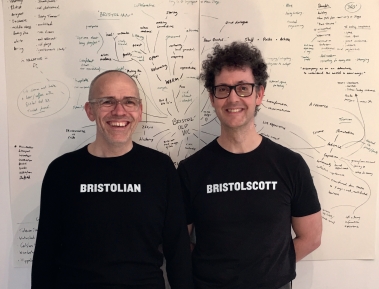
20 Feb 2018Ian Vickers and Scott Doran, Directors at design consultancy Eureka!, lay out in detail the process of developing our bold new brand.
Bristol
A city like no other. And at its heart a theatre like no other.
Bristol Old Vic, built by the people, for the people, has acted as witness to the changing fortunes of the city for over 250 years.
When we were invited to compete for the job of re-branding the Theatre as it embarks upon a new stage in its long and distinguished life, it was a challenge we couldn't refuse.

From our very first meeting with the marketing team and our first visit to Bristol, we immersed ourselves in everything Bristol Old Vic and also Bristolian. We were both born in celebrated UK ports (Grimsby and Glasgow) and we immediately felt at home in the city and grasped the Bristolian energy and industry which makes it such a unique city. We relished getting to know Bristol – visiting frequently over the coming months.
As with Bristol itself, Bristol Old Vic wears its history proudly. And that history is something we wanted to embrace. We delved deep into the riches of The University of Bristol Theatre Collection and Bristol Archives – so lovingly preserved – and traced the evolution and influence of fashions and technologies across the years. From the richly detailed early handbills, to the almost shockingly austere posters of the 1960s, and the introduction of colour printing and photo reproduction, this collection has so much to offer. And that's just the printed history.
Made in Bristol
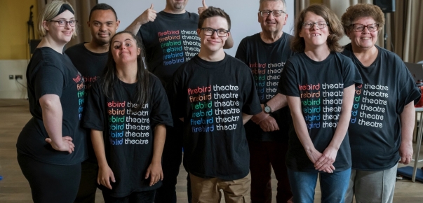
Where Bristol Old Vic really comes to life is through its people. We spent many hours meeting people from all areas of the Theatre – front of house, artistic team, backstage, administration, development, Young Company, studio theatre. And what struck us more than anything was the unequivocal belief in, and passion for, Bristol Old Vic as a place which is vital to Bristolian culture and identity. People have spent their entire working lives here; can't imagine being anywhere else. The pride in this theatre and its place in the local, and national, landscape, is tangible.
So many people having so much invested in a project like this can sometimes be a pressure, but here we found it to be a great support – knowing that the staff feel so positive about Bristol Old Vic, and are so active in the process of making it succeed, we quickly felt part of a strong, supportive team, all pulling in the same direction.

Once fully immersed in all things Bristol, our first task was to pull all our research together and compile a report, with the aim of distilling our findings into a clear brand essence – something which would act as our touchstone throughout the branding project, and against which our work could be measured.
We began a series of brainstorming meetings at Eureka! and with the team at Bristol Old Vic – comprising a representative from all departments – so we had a very healthy mix of opinions and experience. Through visual research, we began to set out a broad picture of how we could imagine the brand in visual terms. Serif or sans serif? Colours? Light or bold? Smooth and clean or rough and textured? Loud or quiet?
Tone of voice, and language, became an important element in our thoughts. So much of our research pointed us towards the people of Bristol, and the fact that the Theatre was built by the people for the people. Increasingly we believed that a key driving force behind the identity should be the dialogue and energy of the people. If possible, the identity should make connections between people, between ideas. It should drive a sense of exchange, of openness and celebration of the Theatre, culture, rich history and embrace the future and the change which was manifest in the redevelopment of the Theatre and the vision of Emma Stenning (Chief Executive) and Tom Morris (Artistic Director).
Making connections
With this is mind we started to look at the inherent physical properties of the words and the relationship between them – at how 'Bristol' relates to 'Old Vic'. Having explored a myriad of approaches and concepts over many weeks, we decided that the words were all that were needed. Other embellishments would be superfluous. And so we naturally gravitated towards an honest and simple solution – the connection between 'Bristol' and 'Old Vic'. In the developed concept, the words have been designed to form a tight lock-up, with a sense of depth between them – the creative connection between the city and its theatre. Bristol is to the fore – the city nurtures the theatre, but the theatre provides a stage upon which the city can express itself.
To emphasise the connections within the mark we created a series of background images – experiments which support this idea, where two images meet together at the heart of the mark and illustrate this dialogue between, for example, the actor and audience, past and present, old and young. This approach will be developed across print materials and also on digital media (e.g. the title sequencing on the film test above).
As the identity began to take shape, we experimented with replacing 'Bristol Old Vic' with other words – creating messages which further express the brand and develop the idea of dialogue and connections, and evoke the Theatre's welcoming, open spirit. Rather than a formal logo appearing everywhere, the new brand is more fluid in that it uses language as an integral means of communicating with audiences whilst being recognisable as Bristol Old Vic.
The brand also celebrates the connections between all facets of Bristol Old Vic's rich new offer – theatre, education, heritage, cafe, new studio theatre, events space.
Brand typeface
We chose Knockout by Hoefler & Co as the leading brand font for the Bristol Old Vic identity, because it has qualities which mirror the personality of Bristol Old Vic – approachable, bold, contemporary – but also has a lineage which can be traced back to early letterpress and billboard posters.
Knockout is a remarkable typeface family of 32 fonts and so this enables the Theatre to have an incredibly flexible and exciting family of fonts to choose from going forward.
We felt that Knockout also best reflected a sense of Bristol and its manufacturing heritage. The typeface is strong and enduring, it feels unapologetic but also sincere and honest.
To support Knockout, we have included Amasis as a secondary font, designed by Ron Carpenter. We felt this font added a humanist mix to the typographic palette whilst having many industrial qualities in common with Knockout. We were also attracted to its refined and delicate qualities. Both fonts sit very well together.
Building the brand
Once we had received great feedback from management and the staff to our brand presentation, we began to test our concepts on some key materials – posters, flyers, brochure and stationery, and also a series of key design templates upon which the website could be built. As materials were approved we began to build a set of brand guidelines and a set of templates for the Theatre’s in-house design team to work with. Because the brand is fluid and perhaps not as conventional as some other theatre brands, we continue to support and consult with the marketing team in order to achieve a successful brand roll-out.
We are also currently working with the architects Haworth Tompkins on the building signage and front of house external graphics.
We are honoured to play our part in creating a brand which will provide a clear and coherent voice for a theatre with unrivalled history and one which is in the spirit of Bristol itself, embracing change, unafraid to take risks, reinvent itself. A theatre with renewed confidence which is reconnecting with the city and the wider Bristolian audience.
We wish the Bristol Old Vic and its dedicated staff every success in the future.
We feel very much part of the Bristol Old Vic family and look forward to seeing the brand come to life on a daily basis as the Theatre takes on the exciting challenges of this new chapter in its life.
Ian Vickers and Scott Doran
Eureka!